Monday, November 20, 2017

Week 13A


November 21-22
- Static Evaluation & Mark up

November 24-26
- Static Evaluation & Mark up
- Begin Content Patterns

November 27-30
- Finish Content Patterns
- Begin Guerrilla Testing

December 1-3
- Finish Guerrilla Testing
- Begin Wireframes

December 3-5
- Finish Wireframes
- Begin Site Design

December 10
- Project Due

Monday, November 13, 2017

Week 12A

In Class

Today in class, we discussed our card sorting experience (For those who got their websites approved by Pannafino) and what we are doing in class.

We are working on a Content Strategy Audit for our website. We are supposed to post our progress on the blog to show how much we got done today in the two and a half hours provided.

Pannafino looked over the four websites I posted on the drive:


The winner is...*drum roll*


Now time to start working on my Content Strategy Audit for this site and work on card sorting as well.
This is what I have for my Content Strategy Audit so far:


Up close: 


Saturday, November 11, 2017

Week 11 Outside of Class

Outside of Class

Over the weekend, we were supposed to get our card sorting done. If our website was not approved by Pannafino, we had the weekend to post more sites on the drive file for him to look over and approve. I posted a few more sites to the drive and got my first response:


So I went to the link Pannafino provided:


I started looking at some possible websites that are poorly organized. Some of the nonprofits didn't even have websites, so that would't help me any. 


I found four websites. I am hopeful at least one website will get approved. Here's some quick images of what the websites look like:


  • Kind of hopeful he tells me to do this one.


  • You can't see the navigation. (Well, you can, but barely...)
  • Stuff everywhere. Good lord. 


  • I mean...it's not bad...but it could be better.
  • Skeptical about this one. 


  • It's not bad...just the graphics...


Wednesday, November 8, 2017

Week 11B

In Class

In class, we signed a thank you poster for Listrak for letting us visit. Then, we discussed how the presentations went with Pannafino and what we are going to do to start our next project.

We are spending the first hour of class searching for "poorly organized websites". We aren't supposed to type it into Google...but I did anyway. I had no luck finding anything saying "These websites are poorly organized! Click here!" But I did have luck finding tons of articles saying "Bad Web Design" or "Websites that Suck".

There is a difference between a poorly designed website and a poorly organized website. A poorly designed website uses hard to read text, colors that when put together will burn your eyes out of their sockets, and low-res images. (To name a few examples)

A poorly organized website will have so much clutter that you won't know where to go on the site. A poorly designed website can look like vomit, but if you can navigate through it without any problems, then it isn't poorly organized.

If you can't find what you're looking for after hours of searching, or the site is hard to navigate, or there's so much information that you feel like you head is going to explode, then that is a poorly organized website.

So after an hour of searching, I was able to find some "poorly organized" websites. This is just my opinion though. These could be perfectly fine when it comes to organization...

  • Pretty sure this website goes on forever. Every time I think I’ve reached the bottom, nope! There’s 10,000 more stories.
  • The only section I see is “Trending Now.” The rest of the information put on the site just seems like it was put there in the order of when it was published…
  • Also, there’s a navigation under the navigation of photos in articles. When you hover over one, it displays the title of the article, and some of them have a “Omg” icon over them in 50% opacity. Or other icons like “Wtf”, “LOL”, “cute”, and a arrow going up? Like an increase in something? What is the point of this navigation? Couldn’t you just click on those icons and it shows you a whole page of “LOL” stories? Or “wtf” stories?
  • This website has about 4 navigations. There’s like, maybe 6 truckloads of information dumped into this site. I can’t imagine what the coding looks like.
  • The animations are interesting, but having the one navigation under the photo pop up really quickly and then not pop up unless you click on it...not sure if that’s needed.
  • I’m not even sure if half of the information on the site is needed, or it’s just been repeated 10,000 times in different places...
  • This website has so many animations going on at once, that it’s hard to find exactly what I’m supposed to be looking at. And these animation’s happen on EVERY page.


  • I wouldn’t say this website is absolutely terrible. What’s confusing me, though, is why the website pops up in a separate page and it’s very small...


  • Where’s the home page?

Monday, November 6, 2017

Week 11A

In Class

In Class, today was the day to present our presentations for the Millersville Admissions Department. I ended up going 3rd to last. I did the User Testing for the Millersville University Undergraduate Admissions Website. My presentation organization was inspired by the example Pannafino provided to us on Google Drive.

I took my own photos for the presentation using my DSLR Camera and my iPhone camera. I took pictures of the Welcome Center and around the Design Building. I even included a picture of the Design Building because the design students were conducting the tests.

I forgot to get photos of inside the Welcome Center, but luckily, I was able to get some photos and squeeze them in at the last minute.

I took pictures around Millersville because I feel it would benefit to the overall appearance of my presentation. I used a dark gray as the background on each slide, and white and gold text. I got the correct color yellow by inspecting the Millersville University Undergraduate Admissions Website and finding the color code.

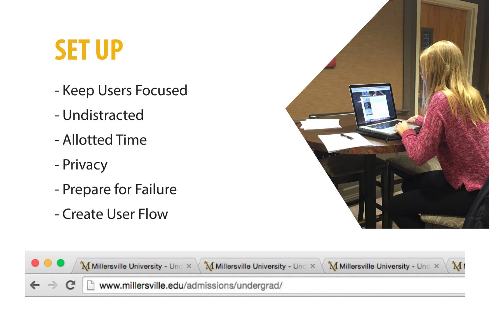
Here is the final design of my presentation:


The sources I used to define guerrilla testing and moderated usability testing are cited in my 1000 word write up.

Saturday, November 4, 2017

Week 10 Outside of Class

Presentation: Finishing Up

I'm about halfway through my presentation. I decided to use the example Pannafino provided to us on the drive as my inspiration. Here is the example provided:


And here is the start of my presentation. I am about halfway done, and am going in the same order as the example. I am providing gaze maps for both of the questions I asked, along with suggestions to make to the Admissions Web Page. Instead of providing "when to use", "why", etc., like the first example used, I decided to go a different route, and provide the main goal, time needed, and steps. 


Week 15B

In Class In class, we had people look over our 2,000 word write-ups and make revisions on Google Drive. This is the feedback I received: ...